Monday 27 January 2014

Logo Design Process

Peeps, I know its been a long time coming, but I'm looking to be more regular this year.

As you may or may not know, I have joined forces with my brother's publishing imprint - Bolt Comics.

For more info about current products you can go here:

boltcomics.net

The big news for me since I last blogged is that my first full length comic, title 'A Brigands Tale' is more than half way done, and will be completed hopefully by the end of February.

So to celebrate, I thought I would go through how the logo for the title was created.

I decided it would not be a good use of my time to DIY a logo, so I got letterer extraordinaire Nic J Shaw to design one for me.

It started with a basic idea:


I had told Nic what the basic feel of the book was and from there he created some options:


From there I decided on the final design, Nick asked me to give him the Hunter's Guild Logo, so I whipped this up in Powerpoint:


Leaving us with the fabulous finished product below:

Nick worked super-fast and the whole thing took about 4 days with back & forth emails etc.

If I had to do it myself, it would have taken me hours, and given me less time to work on my comic.

Sometimes it pays to get someone else to do stuff, especially if they are better at it than you! 

Apart from being in high demand for his lettering skills, Nick is just about to launch a free webcomic that he  is writing called "Action Johnson" its coming real soon go to actionjohnson.com for more info.

As always I welcome any comments or questions you may have!

You can follow me on Twitter here:  @TheDanTribe 

A Brigands Tale and distinctive likenesses thereof  are Trademark & copyright Daniel Tribe.


Monday 21 October 2013

Digital - nil, traditional 1!!

Bummer dudes!

I lost an entire book (28 pages) worth of thumbnails when I tried to re-set some page sizes in Manga Studio last Thursday night.

I think I can go off memory but  this has really upset my apple cart in the digital vs traditional battle.

The new one thing I love about traditional is that it can't be erased due to operator stupidity...
...like page 1 below. 


Anyways, lesson learned, back up the file BEFORE you attempt to change anything and for me anyway, I will be pencilling the rest of the book before scanning it so I have originals to refer to!!!

In other exciting news, Nowra now has an art gallery display place called Squid Studio!!

Locals can like it here:

www.facebook.com/squidstudionowra

They have drawing nights and everything, very cool.

I am thinking I will try and launch 'A Brigand's Tale' there once it is complete!

Another local who will be exhibiting at Squid in December this year is one of my fave's the Heroic Master of Pens (I call him HMOP for short, and at other times, Tom).


He is truly heroic as he works only in ink, no pencils or rubbing out, check out his blog for some more cool stuff!

http://heroicmasterofpens.blogspot.com.au

As always, any comments or questions on this topic or my comic stuff are welcome...

 
Next time: Creating Maquettes for reference - a new experience

Follow me on twitter: @TheDanTribe
All artwork is copyright their respective creators.

Monday 23 September 2013

Cheat week!

Hi Again,

Been a busy week, so I thought I would share something that really helped me realise that it does'nt matter how much life is on your plate, just getting it done is possible!

http://www.michaeleregina.com/blog/?p=1476

Michael is currently Kickstarting the book he talks about in the above link! to check it out go here:

http://www.kickstarter.com/projects/1247384685/adamsville-book-1-the-unknowns


So what excuses are you making for not getting stuff done?

I mean, I don't even know how to colour... and don't have the budget to pay for a colorist...
to get around this problem I'm drawing for black & white, attempting to maximise the high contrast images and shadows to express the world.

This is an example of attempting to convey some menace & mystery...hardly perfect but still worth the attempt....


I have heaps of other excuses, but I have set myself a deadline to complete the story and am still running on time, I am kind of itching to get stuck into some inkslinging but am restraining my self so I can scan my pencils before I go there (just in case I sling my ink to recklessly!!)

I am also planning on starting my CPA studies at the end of the year, but after seeing what Michael has done, I am certain I can still hit my targets.

Any out there got other great time saving tips or suggestions....

If you do please feel free to comment below...

Until next time, don't make excuses, make comics!

Follow me on twitter: @TheDanTribe


All artwork on this page is Trademark & copyright their respective creators.

Monday 16 September 2013

Adventures in Digital workflow

Hi peeps, it's a new week and with a new week a new installment of my blog, apologies for the gap between posts, but I am now back on the wagon after a break...

I previously alluded to the impending delivery of my work process savior, the CINTIQ 13 HD.
Let me tell ya, I'm excited!

Excited Dan
No that's not me with the Cintiq, this is the picture of me being excited when I won the anime DVD prize from www.geekofoz.com! (cool guy follow him on twitter @geekofoz) and Hanabee! (@HanabeeOfficial on the twitters)

Anyway, this picture still reflects my excitement in crossing over to the digital frontier.


You totally just draw on the screen

Cintiq's have largely priced themselves out of the market for hobbyists purely because they are hella expensive, but the CINTIQ 13HD is around $1,100. Not too bad for an investment in productivity...

It takes some getting used to, it also take some time trying to figure out what the optimal pen size to use is because of the frequent zooming in and out that occurs.

I still find it easier to work with a blank piece of paper rather than a blank screen. OS i initially made an A5 booklet with my estimated page count to see if I would make the page count. 
I then thumbnailed the whole story in Manga Studio. This has saved me miles of paper as the failed layout can be covered up by a new layer.


I then got my trusty(?) editor @Andventures to edit my thumbnails in Manga Studio with the old school method of making adjustments in red.


Apparently my work needs to be a bit more Rob Liefeld-esque in the first panel, and a bit less Liefeld inspired in the second. If you can read it the top panel features a suggestion "more pouches" and also a preference for a huge gun instead of an apple. He has also kindly drawn an attempt a huge gun, or blunderbuss if you will. His other observations include "no room for a big gun" and "Liefeld WTF!"- clearly the latter comment somehow suggesting Liefeld considered the 180 degree rule less of a rule and more of a guide only. 

Even though this snippet of advice seems kinda silly, having an editor who doesn't hold back really helps get the best out of you, there's a reason @Andventures is CEO of Bolt comics (its because he has the CEO stamp...)

What I have found is that once you have got the layouts more or less sorted out,doing the pencils on paper seems to go a lot faster.


Til next week when I will discuss in a bit more detail my project, A Brigand's Tale.

Less talk, more comics!

Follow me on Twitter: @TheDanTribe
All characters and their distinctive likenesses thereof  are Trademark & copyright Daniel Tribe.


Monday 17 June 2013

The Adventurers Comic - process interview

My brother is a great guy, he has also just released the first issue of a new mini-series.
We discuss how his creation has gone from the brain to the page...

Dan:Hi Andrew, thanks for joining us, first off would you like to tell us a little bit about your new project?
Andrew:  The Adventurers is a story about 3 unlikely heroes who become friends. Ellie - a dragon, Booster - a robot, and Rocbadger, a well...Rock Badger. 
They end up having exciting adventures together!
D:  Obviously I've read it, and its a really great story, I love that by making it all ages its also accessible for any one to read.
The art is excellent by the way, there are some similarities to Bone, was this intentional? By the way I meant that as a compliment...

A:  Thank you... I love to say that the Adventurers comics is all ages...that means kids can enjoy it as well. My hope is the story can be enjoyed on different levels by children and adults alike. For me good all ages is just that...all ages and to be honest most of my favourite comics are. As for intentionally being similar to Bone no. I'm definitley a Bone fan and Jeff Smith is an amazing story teller so I can say I was inspired by Bone.
D:  Can you tell me about your creative process, story wise do you write the whole thing full script?
A:  I'm still finding my 'process'. Initially I did start with a full script... but fortunately the final script has been changed from the early version. I basically have a plan for what needs to happen in an issue and on each page and work with that. I find fine tuning dialogue the best after the art is finished..
D:  I agree sometimes the characters look like the want to say something else when they get on the page...but you wouldn't change key sentences from the original script would you?
A:  Not pivitol ones, no . I pared down a lot of unnecessary dialogue, but some dialogue is necessary to the development of the story.
D:  So do you then go to the thumbnailing stage, or do you just put it out on right there on the page as you go?
A:  I use thumbnails, usually very loose in order to position panels, characters and to see what works or needs to be reworked.
 D:  So you go from a loose script to thumbnails, and then pencils? Are you working digital, traditional or a hybrid of both?
A:  I guess you could say mostly traditional but we have needed digital to make the final issue print ready. Initially I thought it would only be for lettering but the whole design of the issue from logo, to look, to getting pages the right size for print required digital assistance. A lot of that help came from my letterer Cara(our sister to those not in the family). 
 D:  Yeh we've been to a few of the same parties [they both laugh]
 A:  Haha! Without her help I doubt there would be an issue 1 out there.
 D:  Poignant message about working with family, I covered some of my ideas about this in a previous blog here: http://dantribes-process-blog.blogspot.com.au/2013/05/6-time-saving-tips-when-making-comics.html
D: Onto inking,so you're definitely a marker guy, you don't go in for the beautiful mess of ink, brushes etc?
A:  No... some people have tried to make me feel like less of an artist [glares at Dan] but I guess it comes down to control... I like to control which lines are thick and thin. Also it's what I'm used to working with.
D:  Where was I? That intense glare really threw me for a second there...Oh, you can really see that in The Adventurers art, its very clean, a lot of that would be from a tight rein in the inking stage...speaking of the art, do you think The Adventurers would work better for you in colour? 
Or were you a victim of the high printing costs so it never crossed your mind, or did you always envision it would be a black & white book?
A:  I'm an absolute fan of black and white art. As far as I'm concerned the readers imagination colours the world effectively. The first question most people asked when they saw the art I was working on was "Are you going to colour it?" I guess it's expected today and some people would consider that a failing of The AdventurersHowever a few people have seen the printed copy and actually commented on how the black and white art is just right for it.
D: I totally agree of course (my top 3 all time fave comic series are all black & white - Usagi Yojimbo, Xenozoic tales and TMNT.) However the red cover is kick ass!


A: The Adventurers is a lot less shadowy than my previous art. I drew it with colour in mind. Who knows? maybe one day...
D:One of the trademarks of the art in The Adventurers appear to be the physical 'acting' of the characters, was this intentional when starting out, did you want the story to be told mainly in a visual sense?


A:  Yes. I did not want to use a narrator. I was inspired by the fact that Bone and The Batman animated comics didn't require a 'meanwhile...' to tell you what was happening also you could tell what the characters felt by the art ...not by expositional thought bubbles.

D: Yeh, expostional thought bubbles are so 10 minutes ago. As the writer and artist, it must have been difficult to choose who to get editorial advice from, how did you go about that?

A: [laughs]...no I got it from anyone who wanted to see my work! Friends and family were a big encouragement... My friend Mike in particular would put up with me bouncing ideas off him and if I suggested changes that didn't suit The Adventurers he'd tell me...in no uncertain terms.
D: I been to a few parties with him also, he certainly would know what it takes to be an Evil Genius! That would have helped when writing the main bad guy for the series!


A: My sister (& letterer) Cara watched me drawing it for 10 years...she literally grew up with the Adventurers and is the most protective of what I do with them than anybody. Also I think my brother had a thing to say every now and then...
D:  It's great that those trusted few actually helped to keep the story on the right track, those trusted few, how much of their feedback changed the finished product vis-a-vis story? Or was it more about minor tweaks here & there? I think any input I had was just as a gushing fan boy though if I remember...
A:  Minor tweaks... I guess like me they realised the story has to happen a certain way...I'm just the messenger in a way. I had thought about going a bit more Hollywood with the first issue...jumping straight into a dramatic/action sequence making Ellie more a victim of circumstance than having an adventurous spirit.
D: As the father of a baby girl, I like that Ellie is no-body's victim. Great role model...now onto the visuals of the characters - anyone who has had a go at drawing The Adventurers would agree they are darn hard to get looking right, how did you go about retaining the visual integrity of these deceptively simple looking characters?

A:  [laughs] Some would argue I didn't. As with anything you can see the subtle changes in the way the characters are drawn from issue 1 -3. I did create turn-a-rounds for the characters and referenced these. I also referenced each previous panel when necessary.
D:  Well that means the guy doing the back up story about Booster (me) can breathe a sigh of relief [laughs]
A:  [glares]
D:  So would you say to people about to embark on something that a good rule of thumb would be to have your character designs down before embarking on your story?
A:  Absolutely. Even with the turn-arounds it still made for slow going in some angles to get them to look just right.
D:  Great tip there for those keeping score. Ok, now The Adventurers is a 4 part mini series, how much of the series was completed before you sent issue 1 to the printers?
A: I had almost completed all of the issue 3 art. I know I know...I should have had issue 4 finished as well...but
D: So having the first issue under your belt and in print, is there anything you would do differently production wise with issue #2 onwards?
A:  Apart from quadruple checking your spelling and grammar? Mostly tweaking the digital processes a bit and having the art the correct size first before lettering etc.
D:  So it will still be mainly all done on the page, scanned, and then basically just lettered on computer?
A:  Yes. Some minor edits may be done digitally there are some in issue 1. I have only began my journey really so I'm not sure what advice to give. I can say it's been hard work, rewarding and exciting. My advice is if you have a story that will not go away and you really want to tell it - do it!
D: Well thanks so much for being part of the blog, lastly did I hear that The Adventurers ships Australia wide  with postage for free?
 A:  Only til the end of June!!!!
D:  Well folks better get on it! you can grab a copy here: http://theadventurers.bigcartel.com/ or you can pick it up in person at Supanova Sydney this weekend 21 and 22 June, table O1 in artists alley.

Note: Andrew has just completed a series of blogs about the character development which are also very cool, go here:
http://theadventurerscomic.blogspot.com.au/2013/06/development-of-adventurers-comic.html

Follow him on Twitter: @Andventures or like the Adventurers facebook page for all the latest: 
http://www.facebook.com/AdventurersComic 


Next week: Betrayed by one of my own...

Follow Dan on Twitter: @TheDanTribe

Tuesday 4 June 2013

Darkest Night creator talks comic process

This week I discuss comic making process with prolific creator Hayden Fryer, best known for his Billy the Demon Slayer series. Here we discuss his latest work and how he goes about making comics...

Dan: Thanks for being a part of the blog! Can you tell us a bit about your latest release DARKEST NIGHT?
HF: Thanks, this is always the tricky part, in all honesty I haven't quite worked out the perfect "summary" for the series as yet, hows this: DARKEST NIGHT is an original graphic novel series, written & illustrated by me and published through Siberian Productions. The series follows the trials and tribulations of 3 lives as they cross paths in love, death and revenge.  
Darkest Night - Turning the emotion up a notch
Dan: It's a great read, there's a real produciton quality to this series. For those who need to order this (and you all do) where can one grab a copy?
HF: You can order it directly from me online through my website www.siberianproductions.com, and for those of you who are in Sydney I'll also have copies available at the Supanova Pop Culture Expo in June. And for those of you who read comics digitally now, it's also been submitted to Comixology and is currently under review, so fingers crossed by the time this goes online it's available!

Dan: Cool, nothing like getting yourself a global audience! First off I would just like to say how intriguing the DARKEST NIGHT series is, it's not really an action/comedy adventure like your Billy stuff, its a lot heavier thematically but once you start reading you are totally sucked into this story about real people and you can't stop reading it - even without superpowers or folks being bulletproof in it at all! I think that kind of storytelling is a testament to your skills. Kudos to you for that. The series has a lot of visual storytelling and for me it really reinforces the old comic book making axiom, "show, don't tell".
HF: With regards to the "show don't tell" approach, I've got the mindset that comics as a medium are a quintessentially a visual narrative first and foremost. Follow on for that is that the biggest focus for me on the art side is that it be able to tell the direction of the story coherently without the inclusion of dialogue, exposition, etc. With DARKEST NIGHT I also realised early on in the scripting stage that it would be the visual elements of the story that were the connective tissue to the reader and their empathy towards the characters.

Dan: I think somewhere I read you have done like 600 pages of comic artwork using the same process, for those like me who are trying to nail down an efficient process can you run me through how you go about things?
HF: Sure,actually it's over 700 now! There's a quote by Dave Sim where he references the need to draw 1000 pages before you draw a "Good" page, by that standing I'm nearly 3/4 of the way there. The main difference for the DARKEST NIGHT pages is that I've increased the size of the page; these ones are all at A3 so I've also increased the amount of detail in the frames, redesigned how I draw characters from the ground up and focused more on heavier lighting. This is something that I was tinkering with in Billy: Demon Slayer series two, and also something that's continued to evolve over the course of the series. I also put more focus on the digital effects like lighting. I've also been focusing more on breaking down individual scenes; whereas before I'd have a rough general outline for the story, thumbnail it out hitting the planned story beats and then make the adjustments to the sequential elements of the story telling on the final page (flow, action beats, etc). Now I'm spending a bit more time before I start a drawing a scene/sequence to re-pace it out from the original thumbnails and in some extreme cases this has meant reworking the entire sequence, expanding/trimming the pages involved/needed, repacing panels and on the odd occurence changing the sequence of the individual panels on the page in the final digital layouts to give a different effect.

Starting rough

Story Outline
The series is kind of evolving as I'm creating it, I have a rough outline of events that'll happen in each of the books which all build to the overall finale. But the smaller moments in between have been in a constant state of flux throughout the various stages of production. I knew exactly where I wanted the first book to end, but I was completely blank on how the narrative would get there after the Wake scene in Act Two. After quite a few months of mulling over both the script and the notes I ended up biting the bullet and began Thumbnailing the book from what I had written. Specifically with the intention to just get it started, around this point I was itching to draw some more comic sequentials...
Dan: I know that feeling well! 
HF: By the time I reached where the script ended in the thumbnailing process I'd managed to crack the missing pieces to drive the bridging sections and put everything in place for the lead in to that book's finale.
Dan: That's some good advice there, work on what you can until the missing links show up...At this point do you have a full script for the series?
HF: So at the moment there is no real script per se written for the latter half of Act 2 or any of Act 3. Before I start drawing up a new scene or a sequence I'll generally go back over all of the previous pages and between them, what I've written in the Outline and drawn in the thumbnails I'll have a rough idea on what needs to happen. It's also at this point I'll expand the scene out to more pages or condense it as needed to suit, this is done by working out the focus/keys shots on the page, intent of the sequence & associated elements that will be in play during the sequence.
Thumbnails
Sequence Breakdowns

Pencils & Inks

Once I've worked out the key shots, focus elements, character movements, rough dialogue beats and camera movements; I'll rule up an A3 page and start pencilling up the frames. It's normally at this point where I'll start looking more at the flow of the frames and the general effect of the sequence. Following the pencils is the inking stage (Felt-Tip pens for line work, Brush Pens for larger black areas), where I'll define the shadows and highlights.


Inks
And then once the inks are down I'll scan in the page for the Digital work; each of the frames are worked on individually, half-tone shadows, special effects added, etc. Following that is the digital imposition stage where I'll rearrange the frame sequence where needed if they don't feel to work how I'm intending them to story telling wise.
After all the pages have been digitally positioned for that particular issue, I'll then go back over any previous issues, the script (if it exists), the outline and the thumbnails to work out a rough dialogue to suit the frames.

Dan: So you adjust the script to match more closely match the pictures at this stage?
HF: Yeh, the dialogue then usually gets reworked a couple more times before it's finalised. Normally I'll get a couple of other people to read over it just before finalisation to check for spelling mistakes, grammar, or any dialogue that reads in the sound of my voice [laughs].
Some nice digital post production work 

On the left, inked page, on the right, same page re-ordered for maximum impact!


Dan:Thanks for taking us through your process, it's encouraging to me that you can get a great finished product even though it may not be fully formed at the start! I'll be sure to catch up with you at Sydney Supanova! I'll show you some of my process progress then!

HF: Cheers! Pleasure to do so and I'm really looking forward to seeing what you've got in store for us local readers!

Dan: Will do!

Some great advice there from a real gentleman of Aussie comics, and a truly great storyteller.If it could sum up his advice succinctly maybe it up would be:

I'll leave the last words of the article to Hayden, with his preferred quote when it come to making comics: "Less Talk, more Comics!"

Next week: Progress on the digital frontier...


Tuesday 21 May 2013

Fun with making Digital comics...???

As readers of my previous posts may be aware, I'm working on creating an efficient process to churn out my upcoming webcomic, A Brigand's Tale.

In the coming weeks I will be interviewing some other Aussie creators and picking their brains on how they get stuff done in my search to find (in my best anime voice) 'The Ultimate Technique of The Comic Making Process!'

I was going to use today's post to demonstrate my adventures of dabbling into digital artwork from woe to go, so far though as soon as I start using my PC to do art stuff there's a whole lot more woe than go.

As luck would have it, my tablet and stylus gave up the ghost early in the week, this is what I came up with before said hardware pooped itself:

The non pressure sensitive tablet really did not work out so great for me in this instance using Photoshop. However I do like some of this guy's visuals so its not bad for a first prototype. Not sure it has captured his flamboyance as a teleporting koala, but it's a start...

Changing landscape

So I normally do all my comic work in portrait format but my research indicates webcomics are much better in landscape. Mostly because you can see the whole page when you land there, avoiding people just leaving because as we all know scrolling down is too hard.

This is as far as I got before the aforementioned pen tablet died:


I found the brushes on Manga Studio to be pretty cool, however still not like the real thing (though generally I prefer using steel nibs).

I'm also having trouble figuring out appropriate line weights because when you zoom in & out its easy to lose sight of what needs to be thicker/thinner etc. Also not sure about colour, but as I was experimenting I thought "oh, what the heck!".

This was also meant to be an opening splash page, or at least an attempt at one. Further complicating the whole line weight thing.

Once again I made the rookie mistake of drawing from the hip instead of referencing, which is why there is no actual perspective at all in the page...

On the whole it turned out ok as a test (I wouldn't publish it like this) and I dig the idea of having a really rough 'pencils' layer and then digitally inking on a nice clean layer. There seems to be some good logic to the digital process for at least 2 really good reasons.

1) No messy piles of paper/ink/pencils etc filling up the dining table - thus avoiding the wrath of the wife, and the tidying up and then bringing it all back out again if we have guests who for some reason need to use the table...

2) The entire scan/cleanup stage is eliminated. For me this could be the greatest time saver ever. Allow me to elaborate, the art style for A Brigand's Tale was always intended to be Black & white, but with midtones created by ink washes

Here is an example of an early page before I decided to go landscape:


 I reckon it looks pretty good, BUT trying to clean up ink wash on Photoshop took about 4 hours a page, longer than actually drawing the page! Even then there are still areas that aren't right, for example the sword clash in panel 2 only has 1 sword, the other has been erased by my "cleaning up".

So I really need to spend less time in the transitioning stages and just getting the pages done.

If you haven't checked out abominable.cc please do, - it's an Eisner award winning webseries - entertainment wise it is brilliant, however its also instructional as Karl Kerschl manages to create a great wash effect using Photoshop. By so do proving that I want to do is quite possible. In future updates I will let you see how my attempts go.

Now I know that all seems lost for digital on the face of it, I mean my pen tablet is cactus. You folks must be thinking "is this guy gonna try the digital process with a mouse or something??"

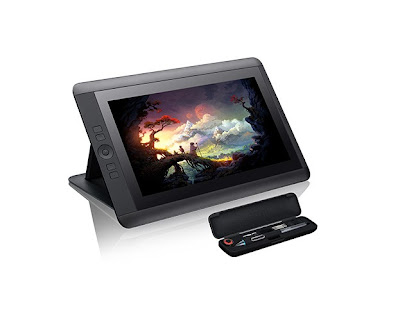
Fear not dear reader, my savior is currently en route from Wacom and will be shipping to me week commencing 25th May.

What am I talking about why this of course:
the CINTIQ 13HD!!!!

Watch the showreel here:


Drawing directly on the screen should be the time saver I'm after. As always the blog will record the progress.

Feel free to comment, especially if you have an different experience, perspective or opinion, I will do my best to respond to them.

Til next week, remember - don't make excuses, make comics!

Dan

Next Week:

Work processes of a 700 plus page dynamo!

Follow me on Twitter: @TheDanTribe
All artwork is Trademark & copyright respective creators, artwork is used for review purposes only.